Drought Visualization
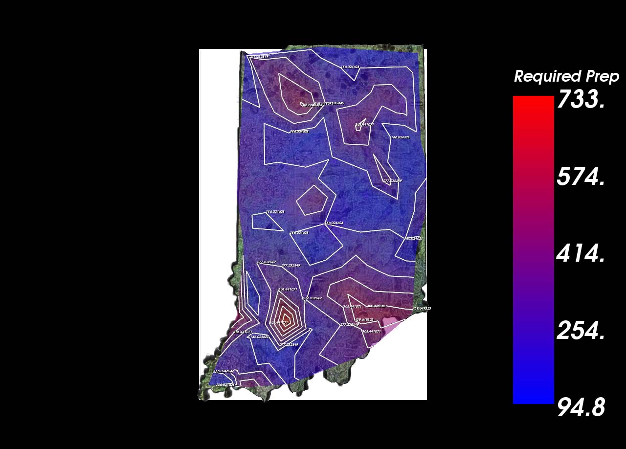
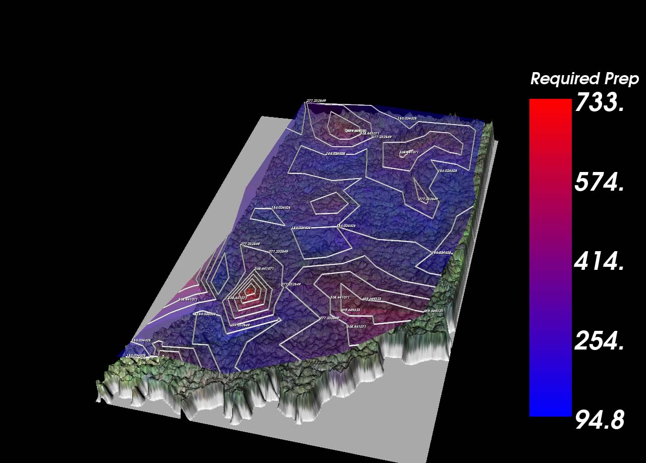
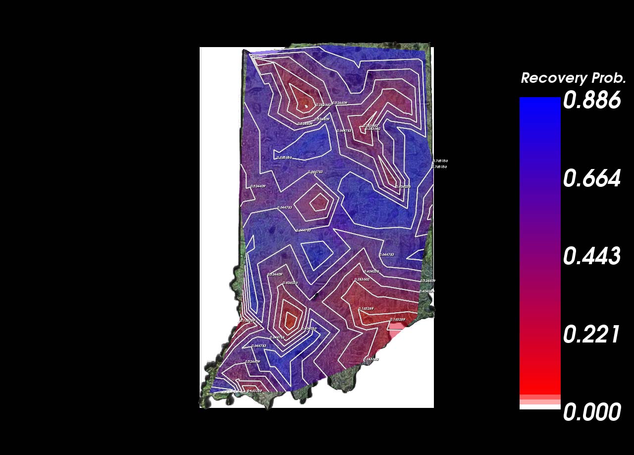
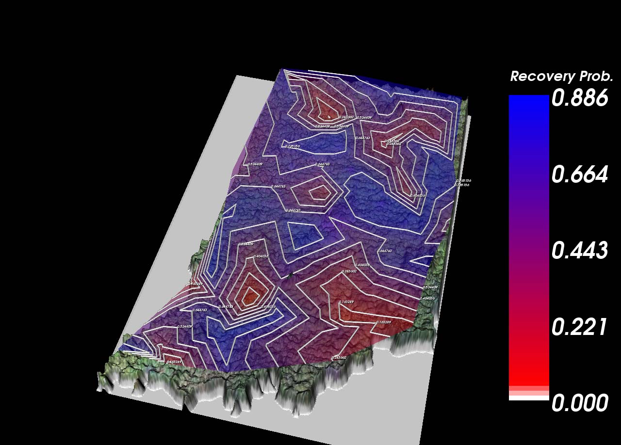
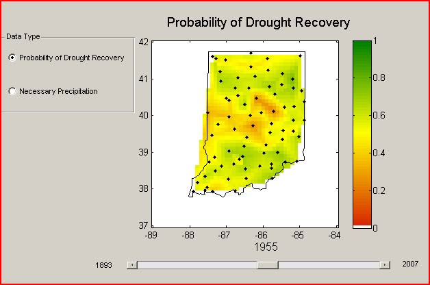
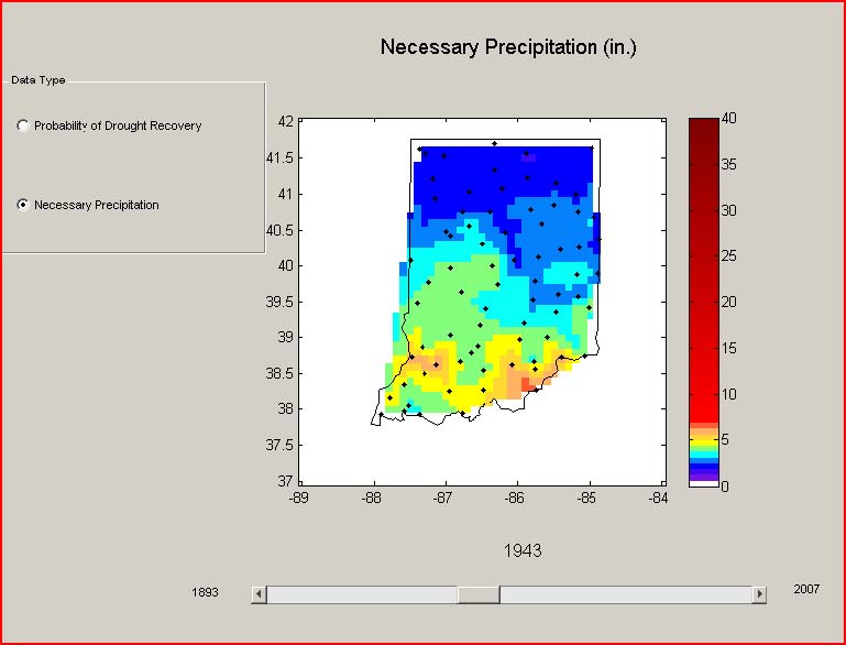
The researchers of the DRINET project computed drought prediction data at 75 observation sites in Indiana for each month between December 1889 and December 2007. The model output was used in a student project in Purdue fall 2009 CS 530 (Introduction to Scientific Visualization). The goal of this project is to develop methods to visualize (1)the precipitation required for recovery from an existing drought and (2) probability of recovery from an existing drought for any given time point and prediction window (1-11 months).
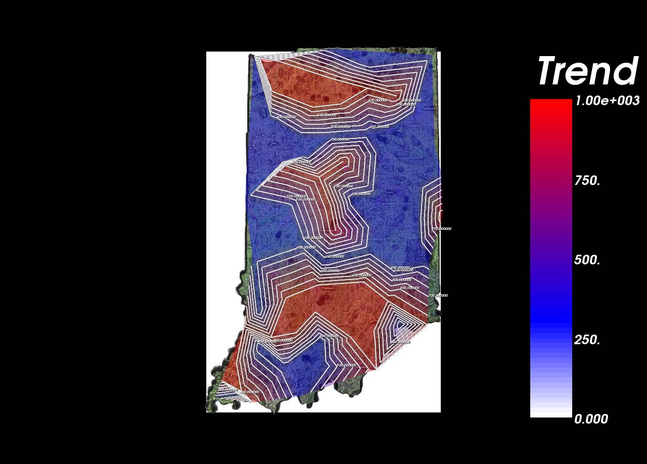
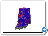
Student Project 1 -- Indiana Drought Visualization
In this project, a system that seeks to intuitively visualize Indiana droughts is designed and implemented. To reconstruct continuous data from the discrete and scattered input, two nonlinear scattered data interpolation schemes are explored. Visualization of the data consists of rendering them in a height map and an isopleth/choropleth map with color coding.
 |
 |
 |
 |
 |
 |
 |
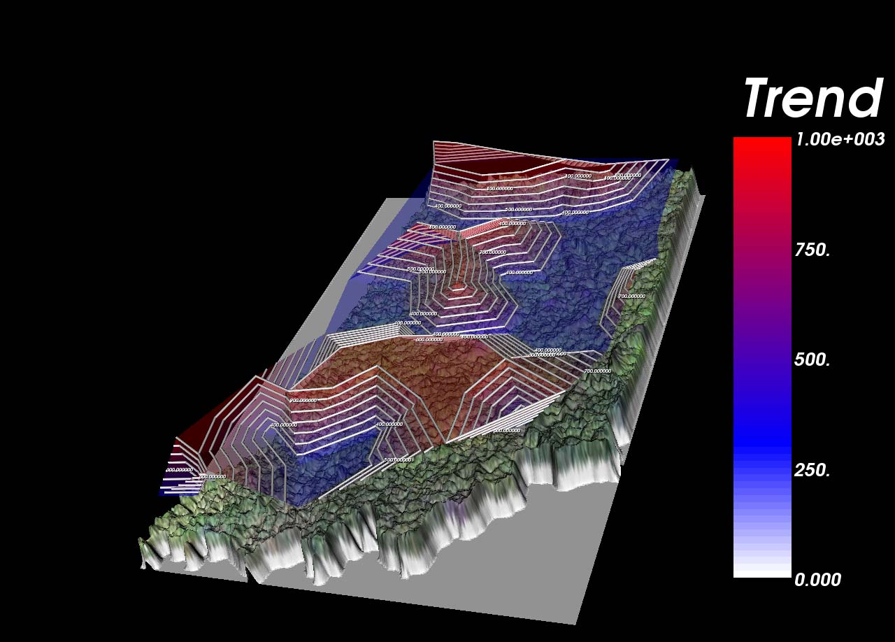
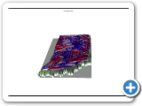
Student Project 2 --3D Drought Visualization
 |
 |
 |
 |
 |
 |
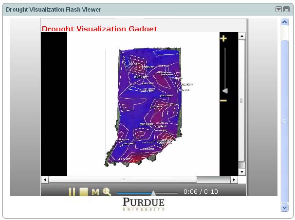 |
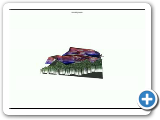
Student Project 3 --Visualizing Drought Status using 3D Isocontour map
In this project, a 3D isocontour map is created to visualize current drought status over Indiana state.
 |
 |
 |
 |
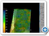
Student Project 4 --Visualization of Drought in Indiana
The focus of this project was to visualize the temporal and spatial relationship of data collected at seventy five stations across Indiana. The goal was to visualize the full meaning of the data in a way that is simple and intuitive for the user. This was accomplished by cutting and filtering the data for simplification, and plotting the data with colorscales and spatial relationships that enhance the meaningful information included in the data.
 |
 |
 |
 |